Auto Race
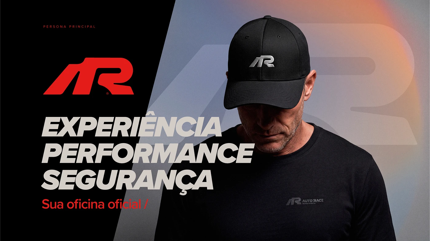
Experience, performance and safety in a new automotive brand.
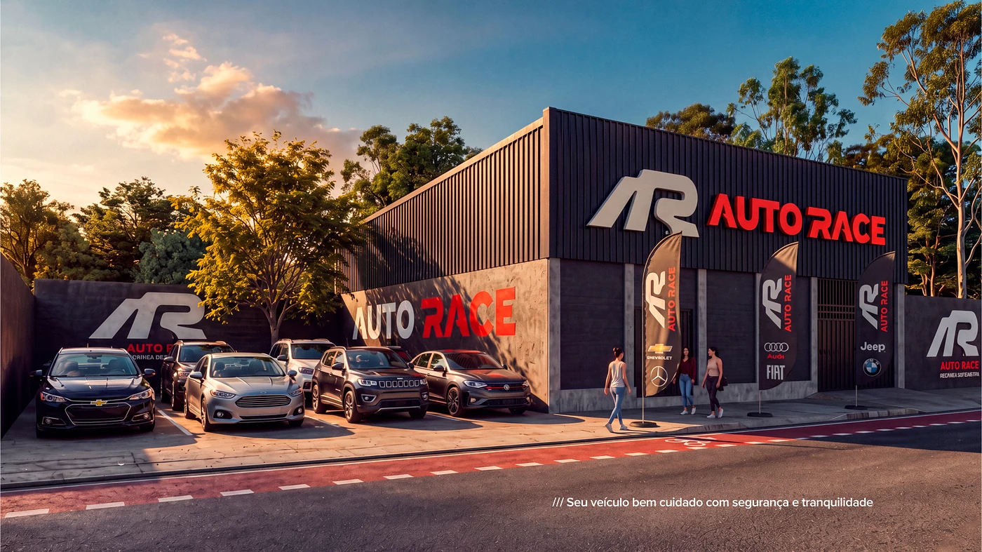
An auto service center that delivers top-level work needed to look, on the street, as precise as it is inside the shop.
Challenge
Break away from the generic landscape of the automotive sector and be remembered for trust.
Auto shops tend to communicate in similar ways: saturated colors, vague promises and little personality.
Auto Race wanted to take a different place in the driver's mind: the place of someone who cares for the car with method and transparency.
Goal
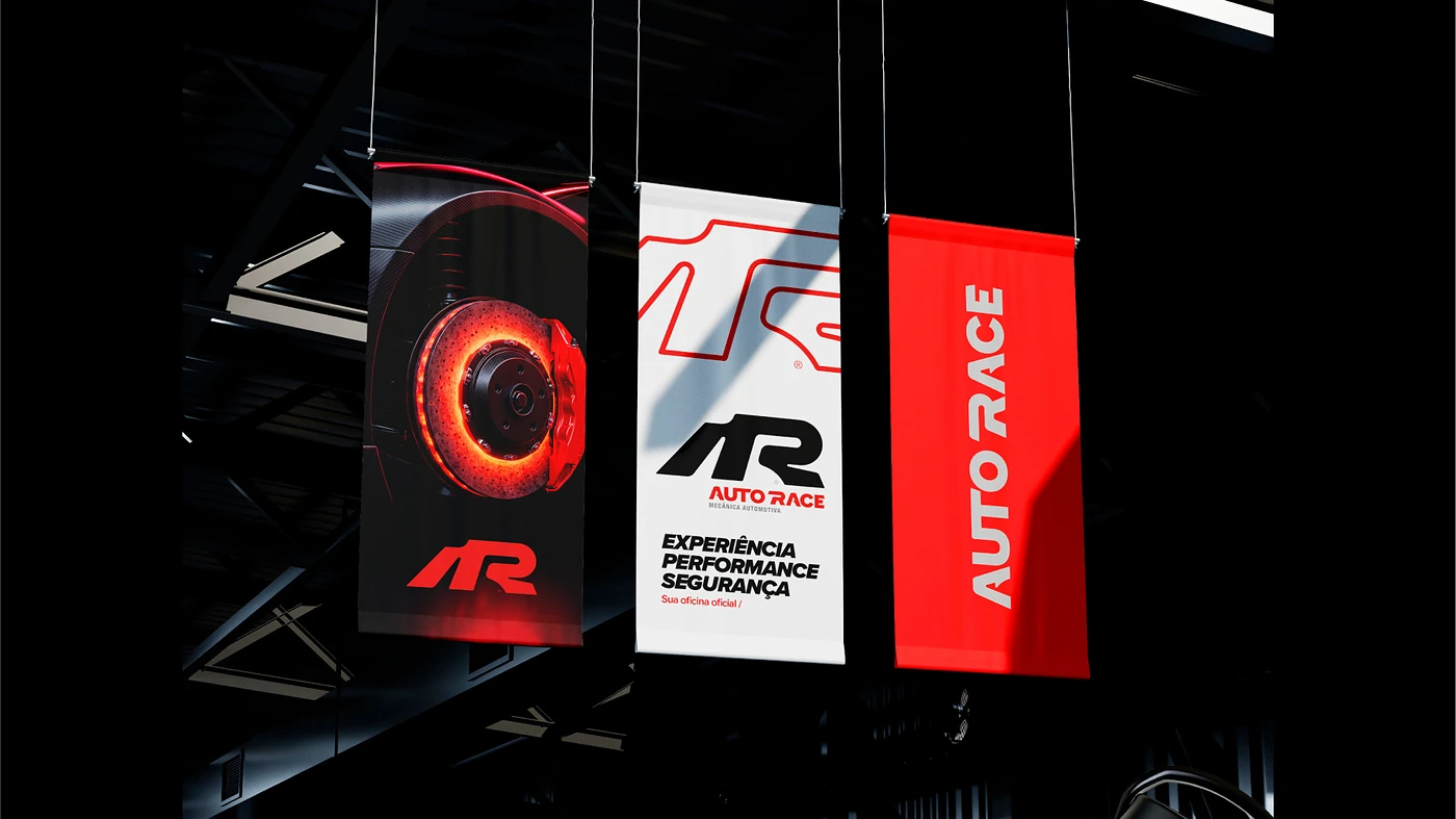
Build an identity with speed and solidity, applied from the storefront to the uniform.
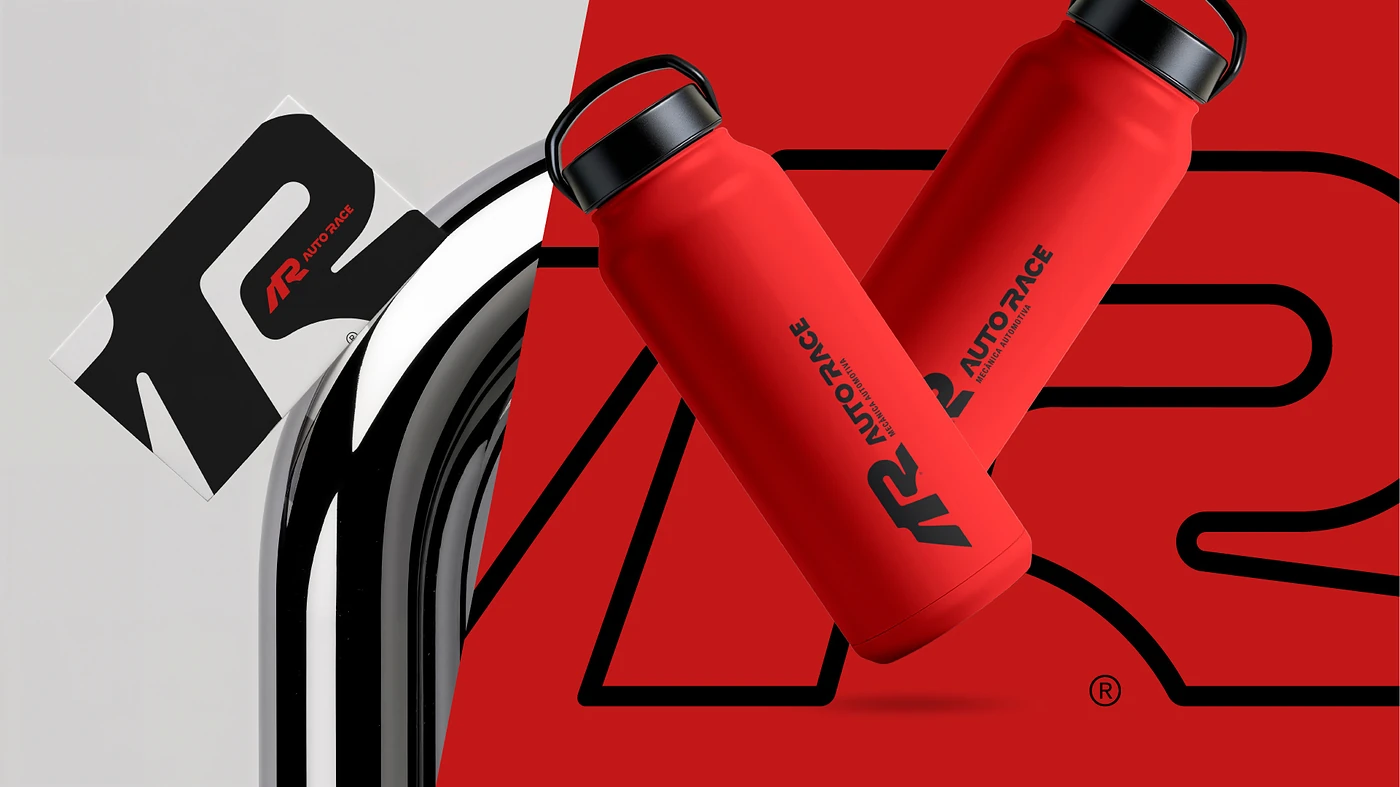
We created the AR symbol, the red, black and white color system, the campaign language and every day-to-day application.
Storefront, internal communication, products, giveaways and the team's apparel line all follow the same visual grammar.
Result
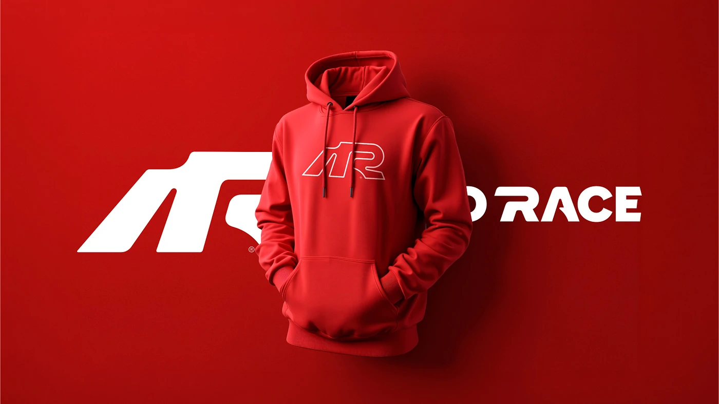
A brand recognizable from a distance, communicating performance in every detail.
Auto Race gained presence on the street and coherence across every touchpoint.
The team began to wear the identity and convey confidence to customers from the moment they arrive at the shop.
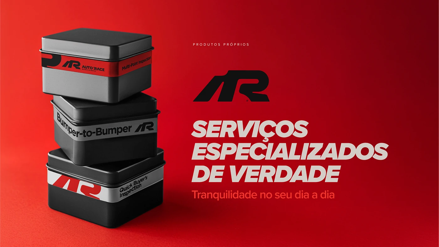
Experience, performance and safety. Three promises, one single brand.